Thursday, December 20, 2018

3rd project, Line project, My friends of art


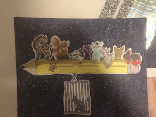
Describe: This piece shows a large pencil floating in a space like background. In front of the space background is a pencil. on the pencil stands all of my friends in the art class, from left to the right it's; Jose, Natalie, amanda, Anna, nick, kim, bailey and me, the one in the cage is Joel. The way you are supposed to approach this piece is from left to right. I encompassed the animals that represented each person's personality.

Analyze: The title of this piece is straight forward, "My friends of art". This title represents the fact that all my friends on the pencil were friends I made in art. There are 2 principles of design in this piece, Emphasis, and movement. Emphasis is incorporated within this piece because the pencil and everyone on it is meant to be the center focus of the I used movement because your eyes move over everyone and then to joel.

Interpret: There actually is a pretty large meaning behind this piece. when I was younger I used to draw cats, and occasionally other animals on a pencil. I chose to do this again because when I was younger it made me really happy, now I can incorporate my amazing friends that I made in art. Besides that, there isn't much of a meaning behind this. With Joel, he's in a cage because this was after he went to jail.

Judge: This piece was really fun to make, and I'm happy with how it turned out. I wish I could have done the coloring a little better, and blended the copics a lot better. my intention, which was to show my friends on a pencil and represent an old thing I did when I was little. Each animal is supposed to represent each friends personality, which I believe was done well. I especially love my line art and how that turned out!


                                              Contemporary artist: Ponder Sprocket

                                     
                                         Master artist: Leonid Afremov


Sunday, December 16, 2018

Project 4, Cut paper, heart of the shrine


Describe: In this piece we see a beautiful night sky as the background, with a shrine encasing a flame with a heart in the middle. The medium of this project is, quite obviously, Cut paper, as well as glue and cardboard. My process was very simple, I started with the background, and mostly went with the flow of what looked best. The heart in the middle was more or less an afterthought, as a way to tie up the entire piece. Which was done very well.

Analyze: The title "Heart of the Shrine" indicates, the fire, is what runs the shrine, as well as that little heart piece. The time period, not explicitly shown in this particular particular piece, but it is very loosely based on older japanese culture. there are a few outside influences that caused me to create this piece, one being the fact I adore different cultures, and the way fire can very easily tie into them. As always, there is at least two principles of design, Emphasis and contrast. With Emphasis, the fire  is the main focus of the piece which is why it's so prominent, this also ties into contrast, because the background is made of gentle cool colors, while the flame is made up of bright vibrant warm colors, in order to drag your eyes to it.

Interpret: There actually is a surprisingly strong meaning behind this piece, though you wouldn't directly notice this unless you look close enough. The meaning, is a way to portray that, in shrines there is always something, that is very important within a shrine, with out that thing, the shrine is meaningless. In this shrine, that THING is the fire, without that fire the shrine would not do what its supposed to do. In this case, bring light, love and warmth to those who give offerings to the shrine.

Judge: This piece turned out really, despite me straying from my original idea. I wish my cuts could have been a bit smoother though. While my lines were slightly messy, the piece still portrayed it's meaning. To be honest I could have done the design of the shrine slightly better and portrayed it a lot better. Over all the piece turned out really well, and I'm especially very proud of how the flames turned. So in the end the piece turned out well.


                                      Contemporary artist: Kanako Abe 


                                     Master artist: Bovey Lee


Saturday, December 15, 2018

Color project, second project, Toby the baby

(there wasn't many references that I used as I was drawing this, as I randomly decided to draw him like this)

Toby the Baby

Describe: In this piece, our goal was to articulate colors into the piece in a very specific way, I chose to use Toby, the character I was obsessing with at the time. Here we can see toby as the center focus, excited to see something new, as indicated by the stars in his eyes. In the background, is the pansexual flag, (as this is what represents a part of him.) he presses his hands to his chest, as he looks as if he's gasping out of joy, or at least that is what I was going for. Also toby, is a satyr, half human, half deer.

Analyze: The Title, "Toby the Baby" represents the fact that Toby, a 24 year old deer, but acts somewhat childish when he's excited. The time period he is in, isn't represented with in the piece he is actually in, so it would be pointless to discuss that. Principles of design is the next topic I'll talk about, there are 2, Emphasis and Patterns. With emphasis he's in the forefront of the piece, therefore brings your eyes towards and emphasizes his presence. With variety there's a variety of patterns mainly with in his hair as well as his eyes, instead of actual pupils I replaced them with stars.

Interpret: In the piece, there isn't too much meaning behind it, besides the actual flag in the background. The flag, as I had said before, the pansexual flag, represents both me and him. pansexual refers to love (or romantic love) towards everyone, regardless of gender or identity, which with Toby, he tends to love everyone, and be open minded towards everyone he meets. In other words, the flag is meant to represent Toby's openness and accepting nature.

Judge: I am surprisingly proud of this piece, The expression is definitely very.. well.... expressive! While I could have done the hands way better it is still done really well. I am proud of how the coloring turned out, as well as the shading, I've gotten better at shading. My intentions with the piece were fairly simple, express my baby's joy and cuteness. I am also very proud of how I drew his expression, it's really expressive and strongly portrays how happy he is.


                                            Contemporary artist: Lavendertowne


                                                    Master Artist: Kazuya Akimoto


Thursday, December 13, 2018

Still LIfe, Project One, Jewelles Byrne, Title: flower on a lake


Reference 1 and 2

Describe: My pieces tend to be very simplistic and straight forward, very rarely straying from the main focus looks wise. This piece in particular showcases a pink flower with another flower of sorts floating behind it, against a night sky, floating on a monochromatic lake. The flower in the background is supposed to both, represent an ice sculpture or a water lily. In front of the water lily stands a proud pink flower, Supposed to be the forefront of the project. The entire thing is tied together by the night sky as well as the monochromatic water that it is resting upon.


Analyze: The title, "Flower on a Lake" a fairly straightforward title,  encasing the most important aspect of the piece, the flower. Due to the simple title there isn't anything behind the title itself. There actually isn't a time period that this piece is from so I cannot expand on that front. There isn't too much to explain with the references, I had struggled with an idea until I found an image on pinterest and went with that idea. regarding principles, there are at least two featured in my art work. There is Contrast, regarding the colors, at first there is monochrome, which shifts to pink and then to light blue, and then  a deep blue. Then there's emphasis, the lake itself, again is monochrome, and the deep blue background, contrasting the bright colors of the flower and water lily, which SHOULD draw your attention to them.

Interpret: This was the first piece of the year, and was drawn due to a sudden Idea, so there isn't much of a large meaning behind the piece itself. There isn't much to this piece, I won't lie, but that doesn't mean there is nothing behind this. First of all, even though I don't incorporate it too much, I adore flowers and the way that you can incorporate them into beautiful ways. The color pallete of the water Lily represents a moon flower, Which also incorporates the night sky in the background. The complete intention of this piece is plain and simple, flowers.

Judge: Time to judge, no? I won't lie when I say that this piece was fairly rushed, I could have done so many things, ten times better. While I enjoy my original idea, it didn't turn out entirely as I had planned. I could have taken more time with this piece, not to mention use a different background, as I use the night sky with pretty much every project. Overall, I am not to happy with this piece as it was fairly rushed.

Master Artist: Albrecht Dürer
Contemporary Artist: Sean Bagshaw